Jun 21, 17 / Leo 04, 01 10:34 UTC
DATA VISUALISED // LIFE EXPECTANCY 
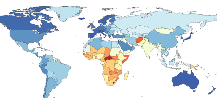
When data is visualised, we get to see a clear picture very quickly! This visualisation shows the life expectancy (LE) around the world and immediately, you can see which countries have a low LE. But how does this help us? How can this be used in Asgardia? When Asgardia uses open data, we can quickly identify and highlight opportunities and gaps in our society. Through the strategic use of open data, we can make informed decisions.
Based on this example, the allocations are resources (whether technological, equipment, medicine, doctors) or the upgrading of existing facilities, our collective effort as a society can help raise the LE of low LE areas. By using open data in a transparent way, we can increase the level of living for all!
CLICK HERE to use the interactive map, and see other metrics like "probability of death". See the difference in figures between the genders.
If you agree with the open and transparent use of data to help Asgardia make informed decisions, then please vote for me in the elections for Strategist

