Jun 20, 17 / Leo 03, 01 08:27 UTC
The importance of Visualising Data 
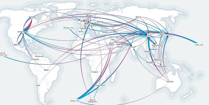
It's amazing what insights can immediately be seen when data is visualised. Have a look at this interactive map of word trade data, where you are able to dive into the different relations between the countries. Although this is data is from 2015, imagine having an up-to-date map with Asgardian data. We could pick up trends, identify opportunities and minimise problems. By using open and transparent data, Asgardia can make informed and evidence based decisions.
CLICK HERE to explore this interactive map
If you agree with the open and transparent use of data to help Asgardia make informed decisions, then please vote for me in the elections for Strategist

